Why You Should Use Google’s Material Design for Your Enterprise App
Once upon a time, Android developers were making awful, terrible mobile applications. Enter Google’s Material Design. Suddenly, designers and developers had easy access to a fully-realized design system. They also had the support of developers building open-sourced interaction libraries in Angular and more.
Material is Google’s attempt to influence the conversation around design on the web and in mobile apps. And looking at how many sites are adopting Materials’ structures and recommendations, I’d say that Google is successfully becoming a design leader in this area.
Material design lays out in great detail how designers should choose fonts, colors, button styles, hover effects, selection controls; how they should build data tables, layout complex navigation elements, how they should arrange photos onto a grid and arrange text by line spacing. There’s a lot there, no doubt. It can be a little overwhelming.
What is Material Design, really?
Beyond being a ‘design system’ and a visual language for design, here’s the no-BS version of what Material can do for your company:
- Material will help relieve your designers of having to make a million design decisions. You can outsource 90% to Google’s impressive design work, and let your designers focus on the work that differentiates you from other companies in the market.
- You immediately get clean design with details that are well-thought out. No more ‘hard’ conversations about fonts and buttons.
- If you use Material’s recommendations, there are a huge number of resources to make development faster – including entire libraries for developers.
- Google has rolled up visual and interactive design into one visual language – meaning you can do more with a single designer (or even a single front-end developer).
What won’t Material Design do??
Keep in mind Material isn’t all-inclusive. Here is what it isn’t:
- It won’t solve your difficult usability problems. If your users have a tough time using your app, Material Design might clean up the interface but it won’t resolve core workflow and usability problems.
- It’s not plug-and-play. You do have to go to non-Google libraries to get good front-end code. There are HTML and CSS templates, but they probably aren’t made by Google.
- It won’t solve all your design problems. Google has put lots of thought into their design system, but they can’t think of everything. You’re still going to have difficult design decisions, and tough choices to make in the dark spots of Material Design.
- If you’re an enterprise and need high-density design, you’re going to have to build on top of Material’s grid systems to improvise your own library. Even despite this shortcoming, it’s still the best design system out there for enterprises.
They’ve put a ton of thought into the details
Designers face a huge challenge when designing a new application from scratch. From fonts, to buttons, to colors, to interactions, there’s a million little decisions that need to be made. The advantage of Material Design is that many of these questions are already answered. Even details like vertical base line grid and label positions and colors are answered. Google has gone to tremendous lengths to think everything through, and it shows.
They’re implementing this across their properties
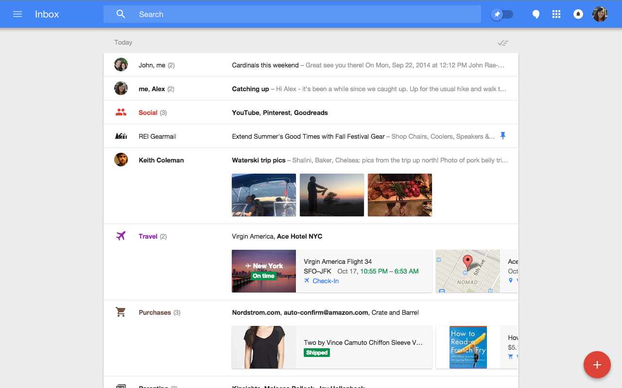
Google is absolutely eating their own dogfood on this. Already much of Google Drive, Inbox, Youtube and other Google properties are getting ‘Material Design’ makeovers. Visually, the properties are clean, consistent in their details and nicely aligned.
They’ve done an excellent job with fonts
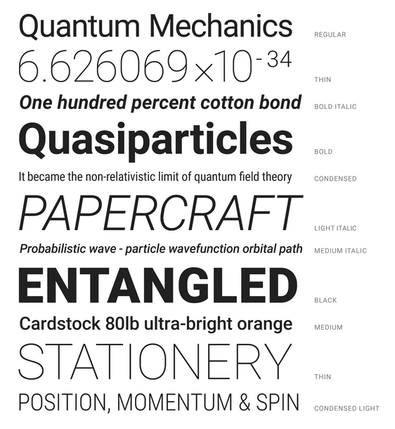 Since many webpages and apps are heavy on text, Material has quite a few recommendations on fonts, typefaces, line spacing and more. I personally love Roboto – the typeface Google picked to represent Material. It’s clean and still has personality. It’s readable at small sizes but looks great in headlines.
Their baseline grid used for fonts is well-developed, and well-thought out. Everything in Material follows a vertical pattern that makes it read well down the page, even if you don’t realize that the page is laid out on a vertical grid.
I particularly like the medium-weight Roboto. One thing to consider is the size of download for Roboto. vs. using Arial, Roboto is at minimum a 500k Download (for 3 font weights.) To get everything you see to the left, you’re looking at 1 MB+. This may not be a concern if you’re sure your users have fast download speeds, but as more and more people work on their phones to download, 1.5MB just for fonts is a heavy burden and something to consider.
It’s not just about graphic design – interaction rules are well thought-out
Google has put a great deal of thought into how the various elements of Material interact with one another to create meaningful experiences for the user. Z-index stacking layers, animations that take place in real space – Material has nice touches that help the user understand hierarchical relationships between elements.
They’re constantly adding new elements to Material Design
As Google puts Material through the tests of using to redesign various properties, it’s inevitably going to change. We’ve already seen data-tables get added, probably from community complaints that Material is a little thin where enterprise and data display is concerned. They’re doing the leg work that you would normally do as a designer.
Your focus can be on making the app as usable as possible and not (for example) what color to make you primary vs. secondary buttons.
If you don’t like a Material design pattern, you can go and see one in action on a Google property that gets millions of hits each month. You can use, and imagine it being used. Then you can better decide whether to use it on your own site.
It’s got broad support from the developer community
There’s an entire angular community dedicated to making open-source code libraries for Material elements. You’re even more locked into Google’s interaction rules, but it saves you a tremendous amount of time having to develop these kinds of delightful details from scratch.
 It’s being used by other consumer and enterprise sites
Examples of Material design abound on the web. One I love is the prototyping tool InVision – they’ve fully embraced Material’s recommendations, while still keeping their own brand alive inside of a standardized set of patterns for navigating and using the web.
It’s built to be mobile-first
You really notice this when you look through Google’s website enumerating Material’s many details. The majority of layouts have been enumerated for the phone and tablet. Perhaps this is why more apps than websites have adopted Material design. What this means is that you don’t need to worry how Material will look on other devices or screen sizes – they’ve already thought this through. Mobile-first means that you can focus your energy on the details, rather than on the bigger implementation questions that usually bog down agile design and development teams.
There’s an ‘enterprise’ side of Material
Since Material was a mobile-first effort, Google started with phones and tablets. As they’re getting more adoption, and people are realizing what a great advantage it is to use Material, more and more enterprise sites are adopting Material. This shows. 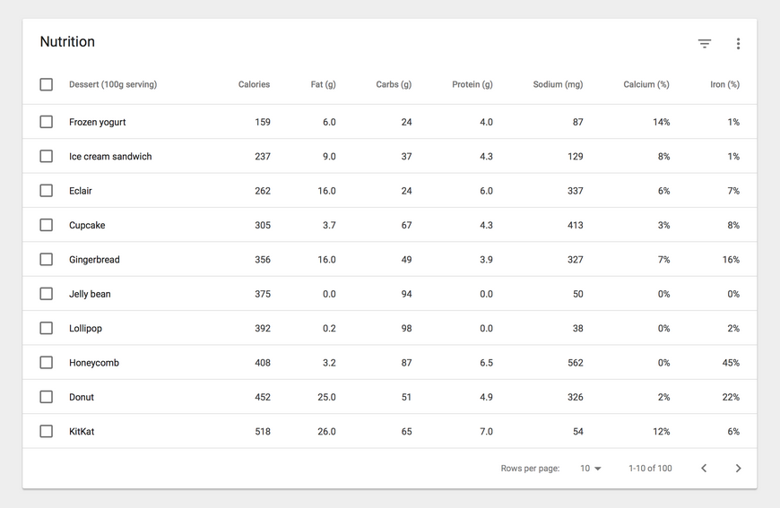 They’ve got an entire section dedicated to ‘data tables’ in Material. I would guess that as burn-rate conscious companies look to beef up their design chops, Material design will be an excellent resource for consumer and enterprise product teams.
Drawback 1: high-density table design needs some work
In the above table, there’s no vertical lines separating the data. This might work for a sparse table, but if you’re looking for high-density display of information, you need things like vertical lines. This might seem nit-picky, but I think it shows that enterprises will need to go the last mile to make Material Design sing for them. Despite this drawback, there’s so much in the rest of Material that I still heartily recommend using it, even for companies looking for a high-density / data-rich visual design language.
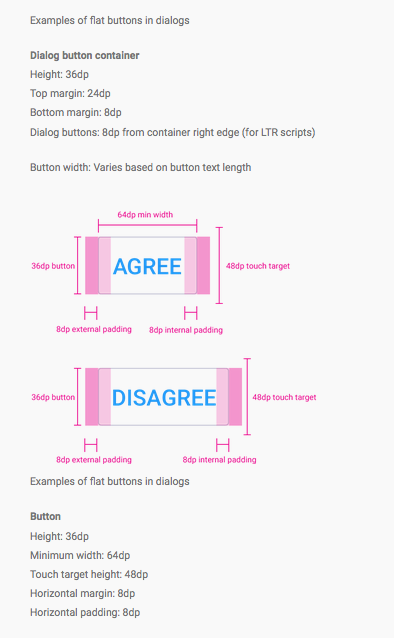
Drawback 2: the buttons are huge
Seriously. It’s almost as if the design team didn’t consider Desktop as an option. But desktop computers aren’t going anywhere, even if mobile traffic becomes a much larger part of internet traffic. The buttons look huge on desktops, especially in an information-dense application. Just scale them down.
Drawback 3: they haven’t thought through some use cases on desktop
Like filters. Pretty basic, and a big part of most apps, but I can’t find anything in Material to solve this common problem. Once again, your designers will still have plenty of work even if you choose to use Material Design as your primary design vocabulary.
Drawback 4: everything (can) start to look the same
This is potentially the biggest problem for teams looking to use Material design: Everything looks the same. The dropshadows and bright colors end up that everything starts to look like Google. InVision has done a great job using Material design to great effect, while still retaining their distinct styling and branding. They wrote an interesting article about their design process using Material design.
Resources
Google’s Material Design resources page
Material Design resources for developers