How to make Gmail-style, user-friendly tables: Part 1
In my experience with enterprise software, it seems that no other data interaction tool gets as much use as the humble table. So let’s make sure we’re making efficient, powerful, user-friendly tables. In the following five articles, I’ll lay out how to build awesome tables, as inspired by Gmail, Google’s massively popular email app.
Just rows and columns
Basic tables are simply lists of rows and columns that make it easier to visually organize data. We see tables everywhere – in email, excel spreadsheets, on menus, in e-commerce sites and pricing guides. For UX designers, this is a great thing – it means a high degree of familiarity. And thanks to Gmail and other email apps, people are familiar with navigating an interactive table, with selectable rows. Today we’ll start with a basic interaction inside the grid – selecting a single row.
Starting with a single selection
When a user selects a row in a table, they’re going to want to do something with it. Our first task needs to be letting them know clearly what’s selected (by highlighting the row) and where they can find the list of available actions.
Use centralized functions to help users learn
Whether a user clicks one row or multiple rows, the list of available actions should be in the same place in the layout. This teaches users whenever they want to take action on a row (or rows) in a table, they go to the same place. The system should be smart enough to deliver the right functionality for the right selection. For instance, you wouldn’t give users the same options for a single select as you would for selecting multiple rows.
The mental model
What we’re really talking about here is the mental model of the table. When someone selects a row, where do they go to act on that selection? Does it change based on whether it’s one row or many?
The answer depends on whether you’re thinking like a developer or a user. To a developer it makes perfect sense to separate a ‘delete 1’ action from a ‘delete many’. The difference to a developer is in code – one function would handle deleting 1 row, and another function would handle the ‘delete many’ use case. For users, they’re just deleting ‘stuff’ – the number of things deleted is fuzzy. They have no concept of the backend complexity or differentiation between those tasks. And they shouldn’t have to.
Move complexity into the code
A decision to centralize the actions means that the development team will be taking on more complexity. This is an important decision as part of making an application more usable. It’ll cost more to develop, yes. But the resulting interface will be much simplified and result in more efficient workflows for the end user.
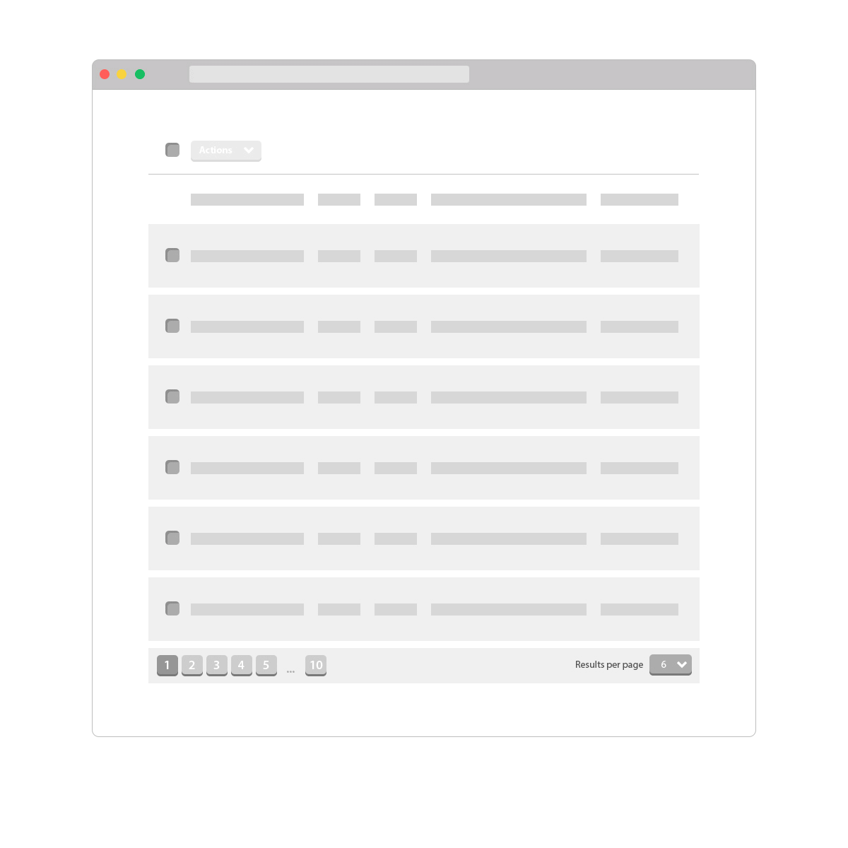
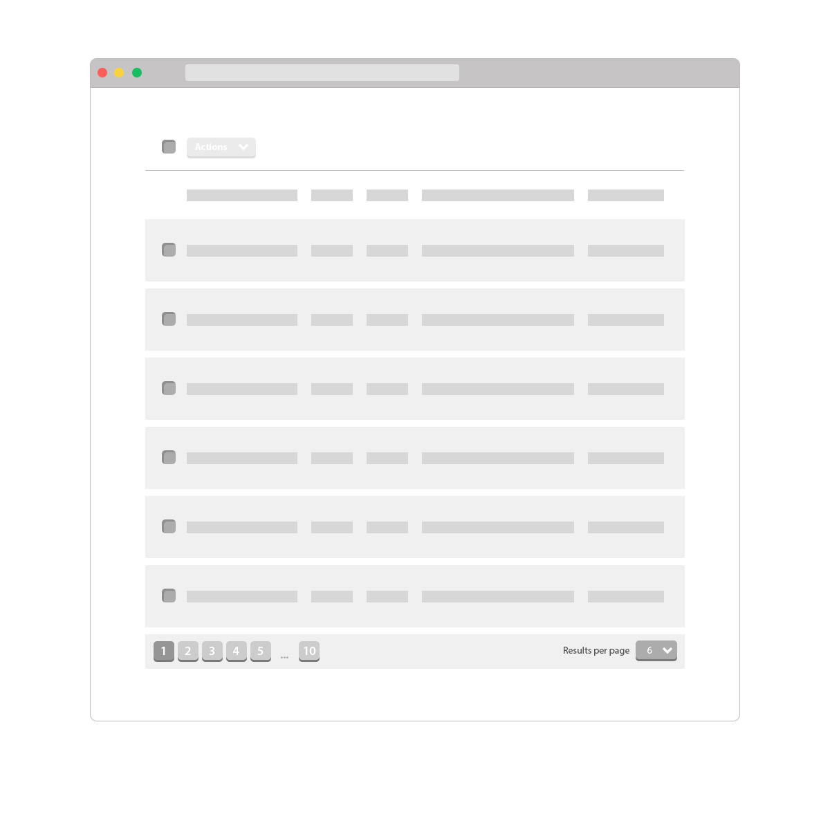
The ‘select-all’ checkbox
Let’s get back to the details of the (awesome) table we’re building to help our users be more efficient at their jobs. The select-all checkbox is an important marker of the state of the table. Not only will it be placed next to the action button, it gives the user some clue as to the state of the table (along with other feedback mechanisms which we’ll discuss later).
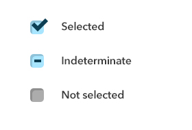
If a user selects all the rows on a page, the top ‘select all’ checkbox will show the top state in the diagram, ‘Selected’. The ‘action’ button will be enabled. If the page is empty selections, the checkbox will show ‘Not selected’, and the action button will be greyed out. If one or more records are selected (but less than the entire set) then the middle status, ‘Indeterminate’ will be indicated. The action button will be enabled with an appropriate list of actions.
Want to know how to construct the ‘indeterminate’ state? Here’s an article from css-tricks.com on how to implement the indeterminate state. It’s not technically a separate state of the checkbox, simply a display mechanism to let the user know what’s going on.