Gmail-style data-tables, part 2
Is anyone else obsessed with data tables? In enterprise UX design, I find that data-tables are central to user’s lives – and yet so often, they are an utter mess. Ease-of-use is often sacrificed at the alter of feature-completeness. This is a false choice, however. Tables can be feature-rich and easy to use. I use Gmail as my model for how to build elegant, functional, easy-to-use data tables.
If you haven’t seen it, part 1 of this series introduces the basic features and interactions of a robust data-table.
In this article, we’ll look at how to remind users that all row functionality is contained at an area at the top of the table.
Color/contrast wayfinding help for first time users
While this design pattern is taken from some of the most popular apps on the web, first-time users may not recognize what to do once they’ve made a selection. To help users understand the availability of the action function (see part 1, here), the action button should become colorful, animate or change in some way to catch a user’s attention. To make it accessible, it may need an additional element to help it stand out to the color-blind (in the US 1 in 12 men and 1 in 200 women are color blind).
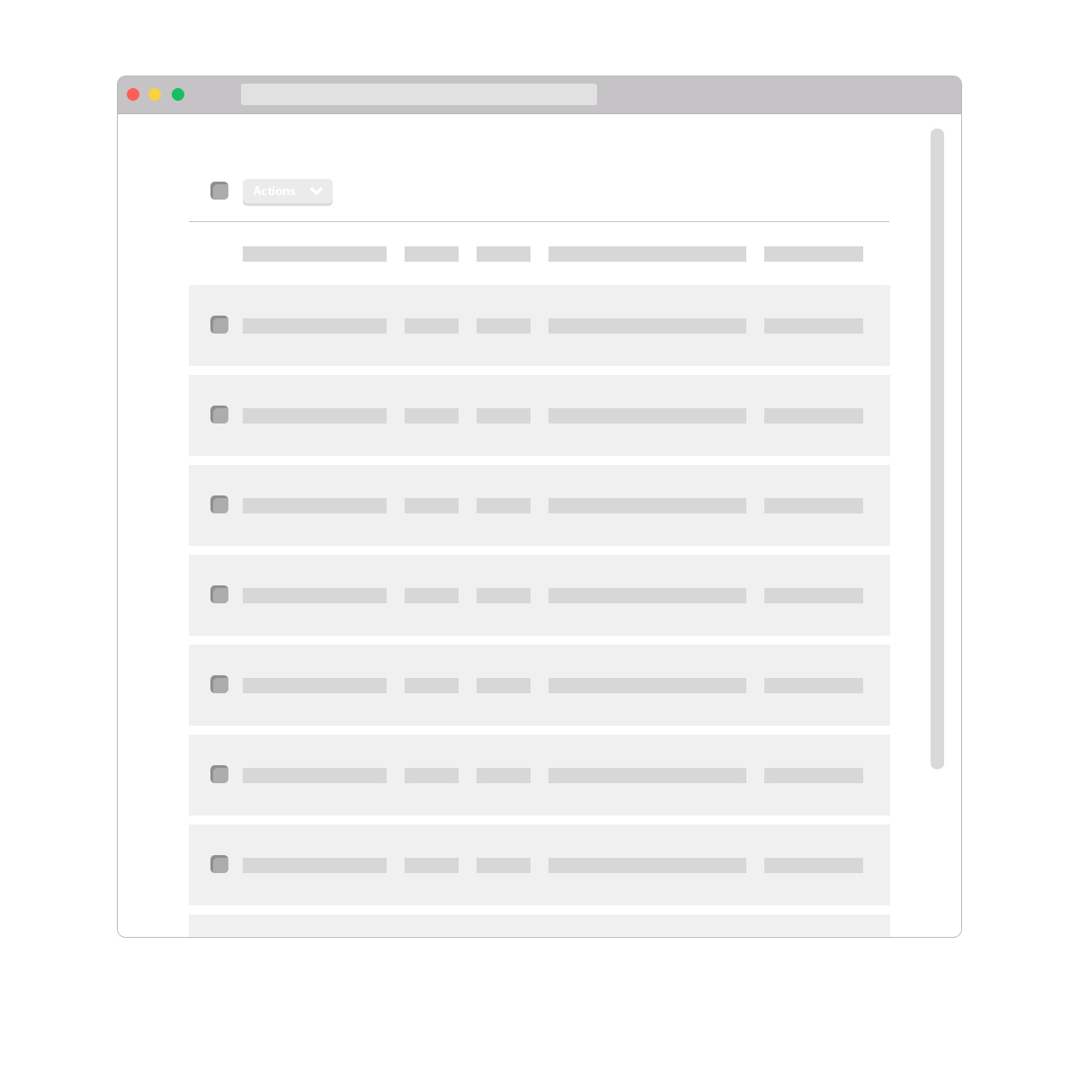
Action button placement
We may need to fix the table header (select all checkbox, action button and column titles) to make sure if the user scrolls they don’t lose sight of the action button.
In part 3 we’ll look at completing an action in a data-table and delivering feedback to users.