Data tables, part 3: user feedback and messaging
At the end of 2015, my company went through an ‘open enrollment’ period, where employees have the option to change or upgrade their benefit elections. I went through my company’s online HR tools to add members of my family to my company’s health benefits. The system did not work well. Despite having the latest visual design, our HR tool did a poor job of giving me feedback about my actions.
After the open enrollment window had closed, I emailed HR to make sure that my family had been added. I had followed all the instructions during the open window for enrollment, but on checking post-enrollment I didn’t see the changes I had made. I was horrified to learn that my family had not been added. My intentions had not been carried out by the system, and my family was not going to be covered by my company’s health insurance. The ensuing storm of emails and documents was a paperwork nightmare I could have done without. In the end, I was able to add them to benefits. But the shock and email back-and-forth could easily been avoided if the system did a better job giving the user (me) feedback about my actions.
Feedback is critical
Feedback isn’t one-and-done activity confined to toast messages. Successful applications give users clear feedback about the results of their actions on a continual basis. This holds true especially for enterprise applications. Users are typically working fast in a complex business area – the results of their actions could have far-reaching consequences (like adding loved ones to health benefits). We need to get this right, for the sake of our users.
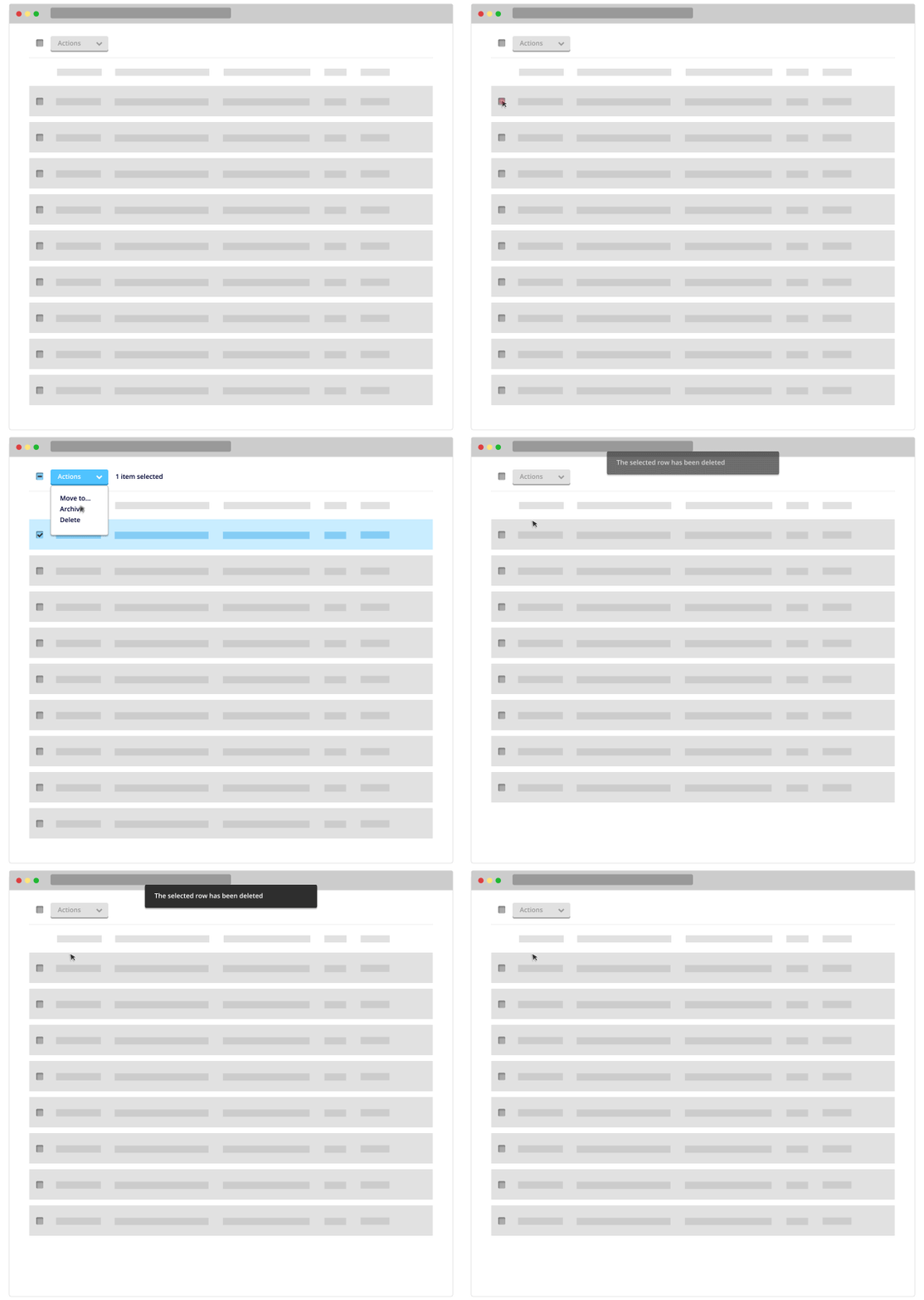
If you’re looking for inspiration, Google’s Material Design language has done an excellent job of designing a clear, color-neutral messaging system. I’ve integrated the visual design of their messaging system into my grid interactions, seen below.
Communication is a constant back-and-forth
User messaging doesn’t always take the form of overt message bars and system messages. Mouse clicks, text entries and other user actions are all opportunities to let the user know that the application is listening closely to their intent. In the example I’ve provided below, user messaging comes in a few different flavors:
- When the user selects a row, the ‘Action’ button becomes enabled, allowing the user to understand that it is now functional
- When the user selects a row, the system tells the user how many items have been selected (next to the action button)
- When a row is deleted, a toast message informs the user that a row has been deleted
Don’t give users the ability to ruin their day
A nice add-on to this flow might be the addition of an ‘undo’ function. I know those can be difficult to implement, but I think we build trust with our applications when users can’t make a mistake in the software that will ruin their day. In fact, that should be a motto of all development teams – don’t let the user accidentally make a decision that can ruin their day. This is a kind of message, a meta-message about the kind of care that a system will take with users. Features like ‘undo’ tells a user that they can use the application free from the worry that they’ll make an irreversible change.
For the next part of the series, I’ll look at in-row actions and how those interact with global actions, and I’ll look at implementing Google’s Material Design into a high-density data table complete with filters, in-row editing, search, and additional options.
If you’re looking for an introduction to data tables, see part 1 of this series here.
